%201.avif)

Price Follows Speculation Part 1: How to Read SPX 0DTE Volume Patterns in Real Time
.png)
Taylor Drake
.png)
April 24th, 2026
.png)
15 minute read
You've been on both sides of this.
The day that trended beautifully from the open where you caught the direction early, rode it all afternoon, and walked away wondering why trading can't always feel that easy.
But the next session was a very different story. Everything on the surface told you it was going to be a repeat of the prior day: similar structure, same pre-market action, even a similar opening range. But this time, the market chopped you to pieces. Every breakout failed. Every pullback reversed.
By 2 PM you'd given back everything from the day before and then some.
So what was really different?
It wasn't the chart pattern. It wasn't the moving averages. And it sure wasn't the talking heads on CNBC.
The difference was hiding underneath the hood of the market, specifically how options speculators were transacting throughout the session.
More specifically, where were they placing their bets? How was that changing over the session? Was their activity building in one direction or scattered across the map?
Here's the punchline, and we're going to give it to you upfront: price follows speculation.
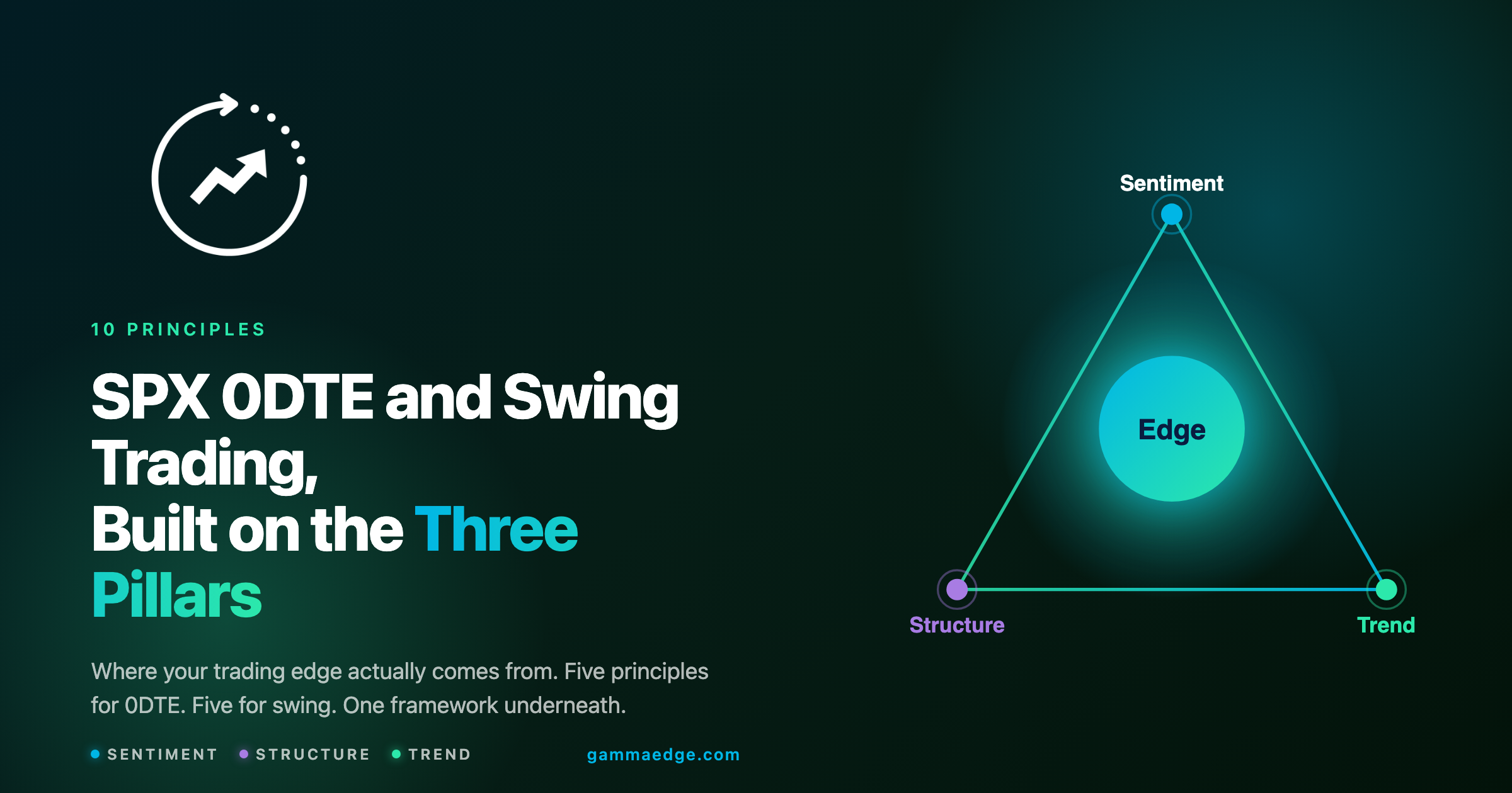
If you can see where call and put speculators are concentrating their 0DTE activity in real time, and how that concentration is shifting throughout the session, you have an enormous informational advantage over anyone relying solely on price-based indicators. This is core to our approach to SPX 0DTE options volume analysis, and it changes how you read every session.
Think about that for a second.
On any given day, well over 50% of total SPX options volume concentrates in the 0DTE contract. That's not a niche corner of the market. The majority of speculative activity lives there, and it has an outsized influence on intraday price action, which we see time and time again. If you want to understand how options drive stock prices, this is where to start.
When you can track that flow in real time, you're not guessing. You're not interpreting lagging indicators. You're reading where the money is actually going, right now, and watching how that evolves minute by minute.
Most traders think about volume as a single number: total contracts traded.
Maybe they glance at a volume bar on their price chart and think "busy day" or "quiet day." But that tells you almost nothing about what's actually happening underneath the hood of the market.
However, what matters isn't *how much* volume is trading. It's where that volume is targeting and how that changes as the session progresses.
And by that we mean that when you break SPX DTE volume into 5-minute slices by strike, you can literally watch speculation migrate through the session.
The shape of each slice tells you a lot.
When volume concentrates around a specific area of strikes and forms a bell-curve shape, that's conviction, meaning speculators are forming a coherent view and clustering their bets around it. When volume spreads out evenly across many strikes, taking that shape that resembles more like a flat rectangle, that's indecision. A good chunk of that rectangular shape is often traders closing losing positions as price moves against them, which spreads volume across strikes without building directional momentum. Volume without direction.
Recognizing the difference between these two shapes immediately tells you whether the session has directional energy or not, before the price chart makes it obvious.
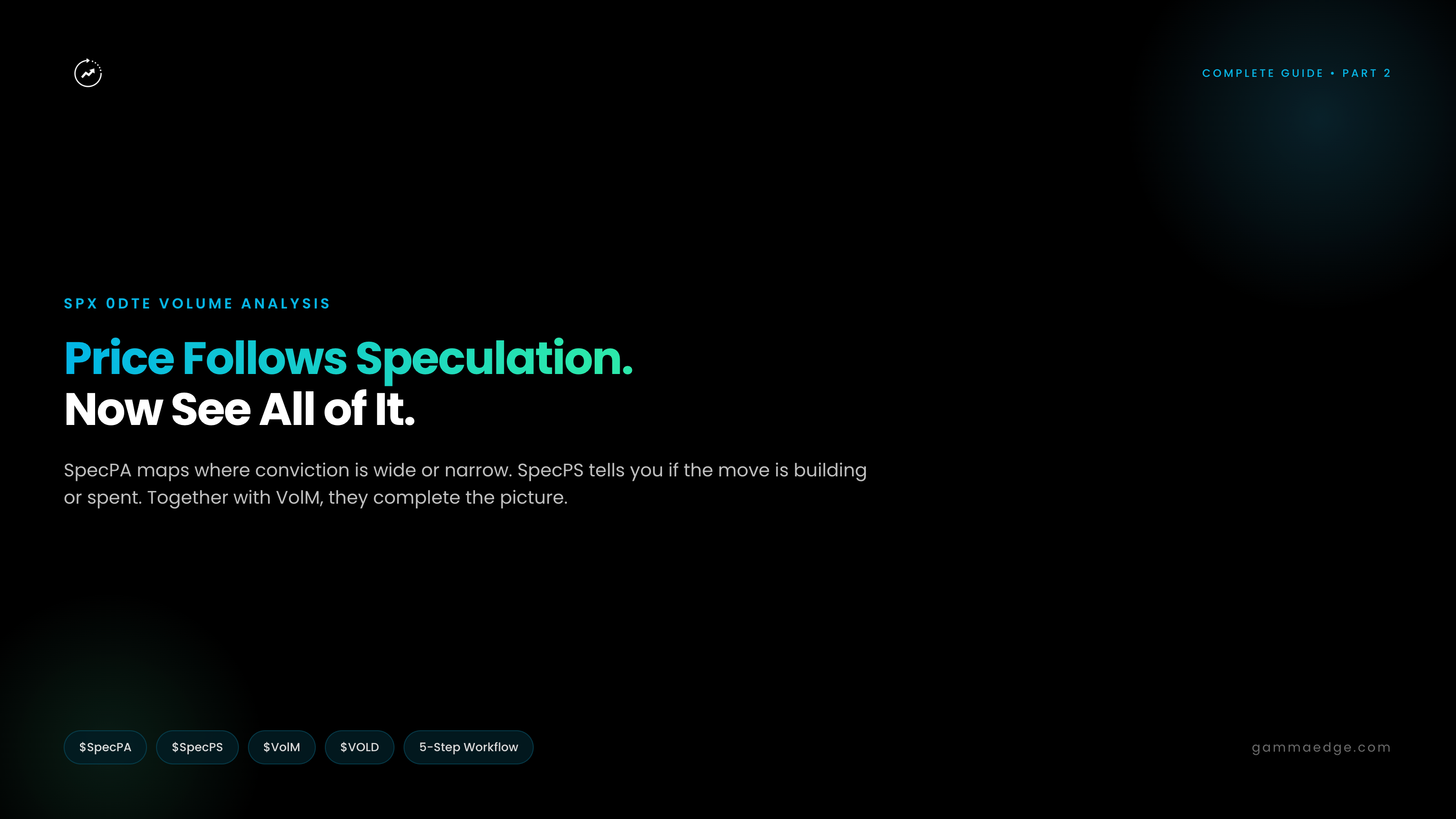
To make this analysis simple and visual, we built VOLD (Volume Differential). It shows you 0DTE volume by strike in 5-minute slices throughout the session, so you can watch exactly how the distribution of speculation is shifting in real time.
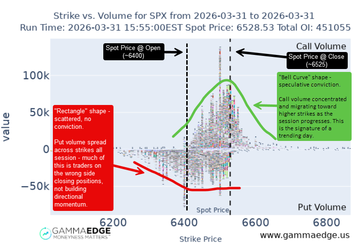
Same session, two completely different stories. The call side shows concentrated conviction migrating higher. The put side shows scattered activity with no directional commitment.
VOLD offers powerful information, but it's raw. You're cycling through individual time slices, comparing distributions manually, and pattern-matching visually. It works, but the natural next question is obvious: *what if we could just track where the bulk of speculation is concentrated and watch where that concentration trends over time?*
That question is exactly what VolM (Volume Momentum) answers, and it's where intraday volume analysis goes from interesting to immediately actionable.
If there's one tool in this entire article that you walk away using every single day, it's this one.
Here's the problem VolM solves: you need to know, quickly, visually, and without any ambiguity, whether today is a trending day or a choppy day, and which direction speculation is leaning.
You don't have time to flip through individual time slices or crunch numbers mid-session. You need a chart that tells you the story at a glance, updates itself throughout the day, and gives you a clear read on where the session is likely headed.
That's exactly what VolM does.
It takes all of that volume-by-strike data we just talked about and distills it into the single most important question: where is speculation concentrated right now, how has that changed over time, and all else being equal, where is that headed through the close of the session?
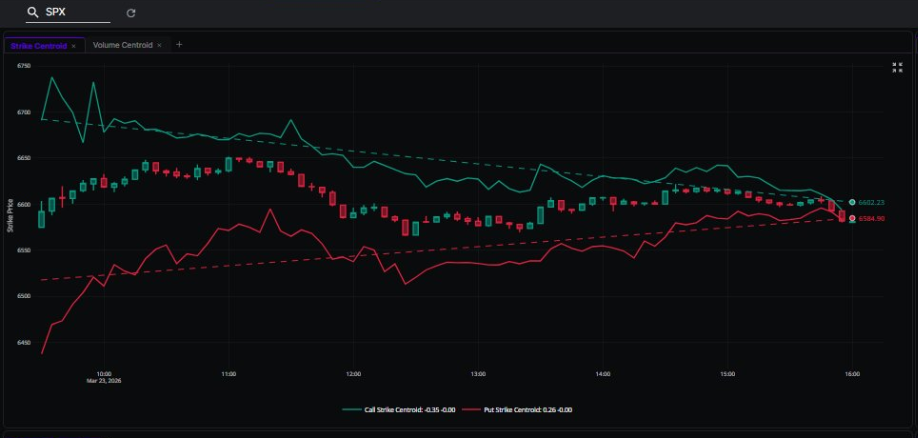
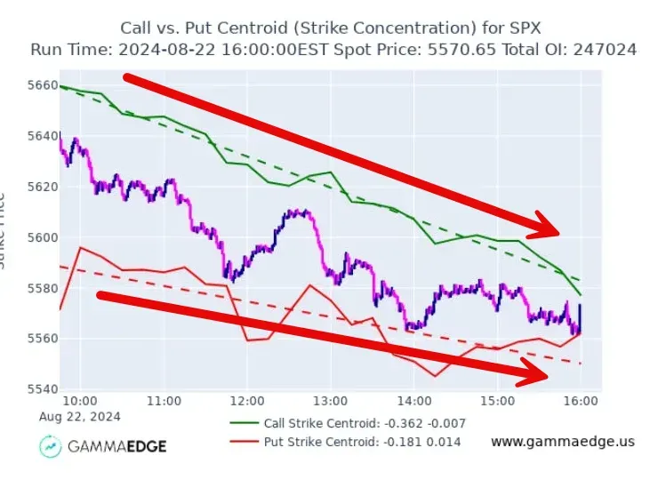
Every 5 minutes, VolM looks at all the call volume and all the put volume across every strike and calculates the balance point for each side. Think of it like this: if you took all the call volume across every strike for a given 5-minute window and balanced it on the tip of a pencil, the strike where it balances is the center of speculation for that period. We call this the **centroid**, and you'll see that term throughout the GammaEdge platform. It's just a precise way of saying "where speculation is concentrated right now."
One thing to keep in mind: this isn't a simple average. It's weighted by distance. A burst of volume at a far OTM strike pulls the centroid more than the same volume near the money, because it has a longer lever arm on that balance point. Most of the time this produces clean, readable trends. Occasionally, a single large trade at a distant strike will noticeably shift a single 5-minute reading. Context (where price is, what the surrounding slices look like) tells you whether that's meaningful or an outlier.
VolM plots a new centroid every 5 minutes for both calls and puts, creating two trendlines that show you how speculation is evolving throughout the session.
That's it. No complicated math on your end. You're watching two lines, one for calls, one for puts, and seeing where speculators are focusing their activity as the day unfolds.
Here's what you're looking at:
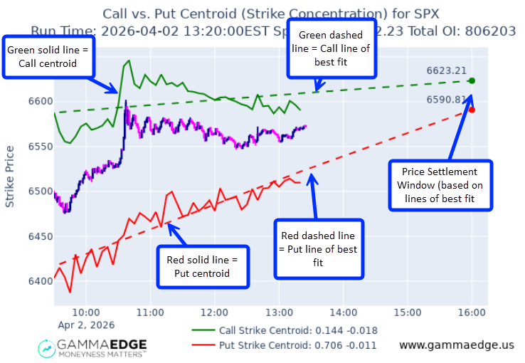
One quick note that trips people up early on: the centroid lines are showing you where speculation is concentrated, **not** where price is. Confusing the two will lead you to misread the chart. The centroid tells you where the speculative activity is focused, which is where price is likely headed, not where it currently sits.
If you're coming from a background in our core SPX 0DTE framework, VolM adds the intraday speculation layer on top of the structural levels you already know.
This is where VolM goes from "interesting chart" to "I'm using this every single day." Five 0DTE volume patterns consistently show up, and each one tells you exactly what kind of session you're in and what to do about it.
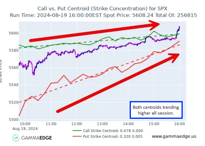
When you see both the green and red lines marching higher throughout the session, you're in a trending day. Call speculators are targeting progressively higher strikes; they're reaching for upside. And put speculators are also moving higher, which typically means they're closing positions as price rises (closing puts removes negative delta, which is bullish).
The lines of best fit will both project upward, and price will generally be confirming with higher highs throughout the session.
What to do: get on the bus. This is the session where you prioritize long-biased trades, look for pullbacks to add, and absolutely do not try to short against the trend. When both lines agree, fighting it is how you give back money.
Here's what this looks like in practice. It's 11:45 AM. Both centroids have been marching higher since mid-morning. The LinFit lines are projecting upward to the close. You've been waiting for a pullback to get long, and here it comes, a quick 10-point dip around noon. You check VolM: both centroids are still trending higher, the pattern hasn't changed, the dip is just noise within a clearly trending session. You take the entry with confidence. By 2pm, price is 30 points higher and still climbing. The centroids told you the dip was an opportunity, not a reversal, before price confirmed it.
This one's sneaky because it doesn't look dramatic. Call centroids are gradually declining, meaning call speculators are either closing positions or targeting lower strikes. Meanwhile, put centroids stay relatively flat. Price drifts sideways to lower without any aggressive selloff.
What to do: be cautious with longs. This isn't a crash; it's a slow bleed. Don't expect a sustained rally to bail you out. If you're in long positions, tighten your management. If you're looking for new entries, this isn't the session for aggressive directional bets. Rather, directional-neutral play often has success when these conditions are present, such as an iron condor. Consider butterfly strategies for range-bound days when you see this pattern developing.
This is the mirror image of Pattern 2, and it's easy to misread if you're only watching the call side.
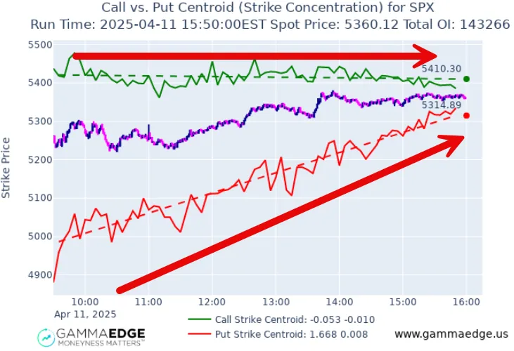
Call centroids stay relatively flat throughout the session. Call speculators aren't reaching for higher strikes or pulling back. Meanwhile, put centroids are steadily trending higher, which means put holders are closing positions as price drifts up. The move higher isn't being driven by aggressive new call buying. It's being driven by the put side unwinding.
What to do: recognize that this is a grind, not a sprint. Price can drift higher in this environment, but without fresh call speculation fueling the move, it's unlikely to produce a strong trending day. The rally is built on fear dissipating (puts closing), not greed building (new calls opening). Be cautious chasing aggressively; the upside is real but limited. If call centroids start joining in and trending higher too, that's when the grind can turn into a genuine trend (Pattern 1). Until then, manage expectations accordingly.
This is the one that saves you the most money, not by making you money, but by keeping you out of the meat grinder.
When call centroids trend lower and put centroids trend higher, the two lines are converging toward each other. Nobody has conviction. Call speculators are pulling back, put speculators are pulling back, and price oscillates in a range with no sustained direction. Every breakout fades. Every dip gets bought. It's a tug-of-war with no winner.
What to do: reduce your size or sit out entirely. This is where traders get destroyed trying to force directional trades that don't exist. If both lines are moving toward each other, the market is telling you there's no edge in picking a direction. Listen to it.
Think about how many times you've forced a directional trade on a day like this and wondered why nothing worked. The centroids were converging the whole time, telling you there was no edge. You just couldn't see it.
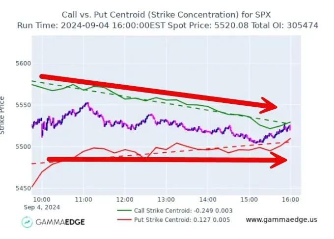
The mirror image of Pattern 1. Both lines heading lower. Call speculators are closing or targeting lower strikes, put speculators are actively targeting lower strikes. Lines of best fit project downward. Price confirms with lower lows.
What to do: capital preservation or short-biased trades. Don't try to be a hero and catch the bottom. When both centroids agree to the downside, the speculative energy is decisively bearish. Monitor for a potential reversal (centroids flattening and starting to reverse), but don't anticipate it. This is the environment where understanding market makers and dealer hedging dynamics becomes critical, because dealer positioning can accelerate the move.
One of the most common misreads in **intraday speculation** analysis is assuming that put centroids trending higher means the market is bearish. It often means the opposite.
When put centroids trend higher, it typically means put holders are closing positions as price rises. That removes negative delta from the market, which is bullish. The key distinction is *why* the centroids are moving, not just which direction.
This is what separates the "grind higher" (Pattern 3) from the genuine trending day (Pattern 1). In a grind, only the put side is moving. The rally is powered by fear unwinding, not by new bullish speculation. In a trend, both sides are moving higher. Calls are reaching for upside AND puts are closing. That's the full confirmation.
Understanding this distinction helps you calibrate your expectations. A grind can still make you money, but you need to manage it differently than a trend. You're trading a slower, more tentative move with limited upside, not a session where the wind is fully at your back.
The dashed lines on the VolM chart take the trend of the centroids (i.e., speculation) from the open to whatever point we're at in the trading day, and project forward to the close.
They answer a simple question: based on everything that's transacted through this point and time today, where are we likely to end up if the current market behavior continues?
This is a forward-looking projection, not a fixed target. As new centroid values come in every 5 minutes, the lines adjust. They're constantly updating based on evolving speculative behavior. But the directional read is powerful: if we understand where the centroids are trending, we have a strong sense of where price may finish the session.
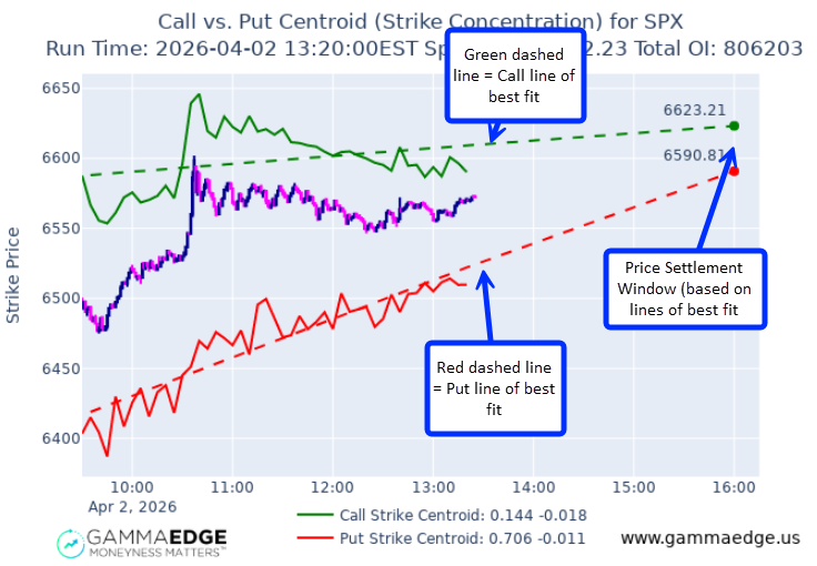
The LinFit lines are especially useful when combined with the structural levels from [transition zones and structural levels](https://www.gammaedge.com/blog/the-ultimate-guide-to-trading-transition-zones-how-to-read-market-structure-for-consistent-profits). If the LinFit projects toward a known structural level, you have confluence between speculation momentum and market structure.
After extensive use and observation, a few guidelines consistently hold true:
No, and we'd never claim that. Volume measures where speculators are transacting right now. It's a real-time read on market sentiment, not a crystal ball. But here's what we've observed consistently: price generally follows where speculation concentrates. Spot rarely sustains at levels where there's no volume supporting it. So while volume doesn't predict price, it tells you where the market's focus is concentrated, and price tends to go where the focus goes.
The best reads come after the London close at 11:30 AM ET. Before that, European traders are still active, cross-market noise is higher, and the centroid data hasn't accumulated enough readings to show meaningful trends. You'll start to see patterns forming earlier in the session, but if you're making your biggest decisions of the day, wait for post-11:30 confirmation.
Not exactly. They're dynamic projections, based on everything that's transacted so far, where will the centroids end up by the close if the current pattern continues? They update every 5 minutes as new centroid values come in, so they're constantly adjusting to reflect what's actually happening. Think of them as the market's most probable destination based on current speculative behavior, not a fixed number to trade against.
Not directly from volume alone. Volume shows you that transactions occurred at a strike, but not whether those were opening or closing trades. However, you can infer it by combining centroid direction with price action. If put centroids are trending higher while price is rising, puts are likely being closed. If call centroids are trending higher while price is rising, calls are likely being opened. The direction of speculation matters more than whether individual contracts are opening or closing; the trend tells you the story either way.
We've tested everything from 1-minute to 15-minute intervals. Shorter timeframes introduce too much noise; the data gets jittery and the centroid movements become harder to read with any confidence. Longer timeframes smooth things out too much and miss important shifts in speculation. Five minutes is the sweet spot: frequent enough to catch meaningful changes as they develop, smooth enough to filter out the noise that leads to bad decisions.
This analysis is specifically designed for SPX 0DTE, where 40-60% of total volume concentrates in the same-day expiration. That volume concentration is what makes the centroid analysis so powerful; there's enough speculative activity to produce reliable, meaningful patterns. Individual stocks and ETFs don't have the same 0DTE volume concentration (they typically only offer weekly expirations), so the centroid and spaghetti model analysis doesn't translate directly. For individual stock analysis, other tools in the GammaEdge toolkit are better suited. If you're new to 0DTE in general, our essential guide to 0DTE options covers the fundamentals.
Price follows speculation. And now you have the tools to see it.
VolM gives you the answer to the most important question of every trading session: what kind of day is this, and what should I do about it? Five patterns, five clear reads. The centroid lines show you where speculation is clustering. The lines of best fit project where it's headed. And the rules of thumb give you the guardrails to trade with confidence.
There are plenty of intraday tools out there that make things harder than they need to be: more indicators, more complexity, more noise. This is the opposite. Simple concepts, clear visuals, reads you can act on immediately.
So here's what we'd suggest: pull up VolM on your very next trading session. Don't trade off it yet. Just watch. Watch the centroids form. Watch the patterns develop. See for yourself how the day's character shows up in the volume before it shows up on the price chart. Once you've seen it, you won't want to trade without it.
Until next time,
Taylor
GammaEdge Co-Founder
If you're ready to dive deeper into SPX 0DTE options volume analysis and the rest of the GammaEdge methodology, here are two places to start:
GammaEdge FastPass Free Course: Our flagship educational course walks you through Structure, Sentiment, and Trend from the ground up, including how VolM, VOLD, and centroid analysis fit into the bigger picture. It's completely free.
Join the GammaEdge Discord: Real-time analysis, trade discussion, and a community of traders applying these concepts every session. See VolM reads happening live alongside the commentary that explains them.